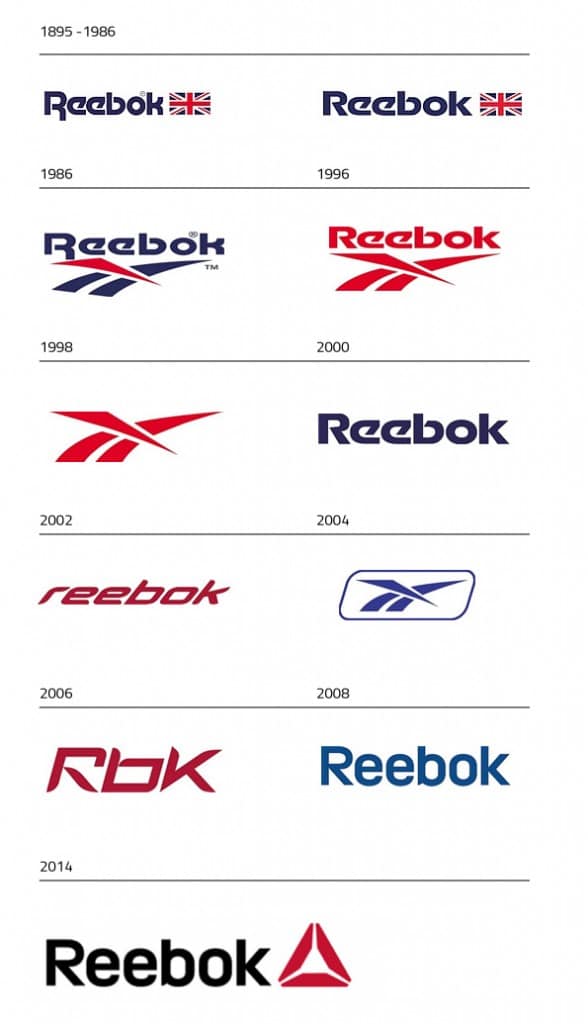
The 2014 logo is their most current logo to this date. The delta logo is used to symbolize what the (shoe) company wants to promote - a change for the better in social, mental, and physical health. Our bodies are meant to move and getting physically active on a regular basis addresses those issues. Matt O'Toole, head of the global brand explains:
Further thoughts on this topic can be read here.
I like the delta logo much better. It's more aesthetically pleasing, more modern and more relevant. The logo doesn't look so out-of-place and you don't have design the shoe based on this logo just to make the shoe look good. Here is a screen capture of the Crossfit Nano 5.0 from the video:
To see my custom-coloured version of this shoe model, refer to this post. You can slap the delta logo on many more design styles than the streak-slash logo, without making it look out of place.


No comments :
Post a Comment
Remember to subscribe to my blog. Follow me by e-mail on the left-hand pane to know when I make new posts!!